Redesigning Video Relevance Evaluation for AI Training
Microsoft Bing AI: HITapp Video Relevance Task
The Challenge
Microsoft’s Bing AI team needed high-quality labeled data to train machine learning models for video recommendation systems. Human evaluators (called “judges”) used a platform called HITapp to assess whether videos were relevant to news articles—a critical task for improving content recommendation accuracy.
However, the video relevance HITapp was experiencing significant performance issues:
Judges performed well in training, demonstrating clear understanding of the relevance categories. But when evaluating real article-video pairs at scale, their performance dropped significantly. The data quality was too poor to use for training Microsoft’s AI systems.
My Role
UX Designer responsible for redesigning the video relevance evaluation interface to improve both data quality and worker efficiency. I led the research, design, and implementation process, working closely with judges and Microsoft’s engineering team.
Research & Discovery
Understanding the Problem
I conducted research sessions with judges to understand their workflow and analyzed over 500 completed tasks. The research revealed a critical insight: the interface was creating massive cognitive load that prevented judges from executing what they’d learned in training.
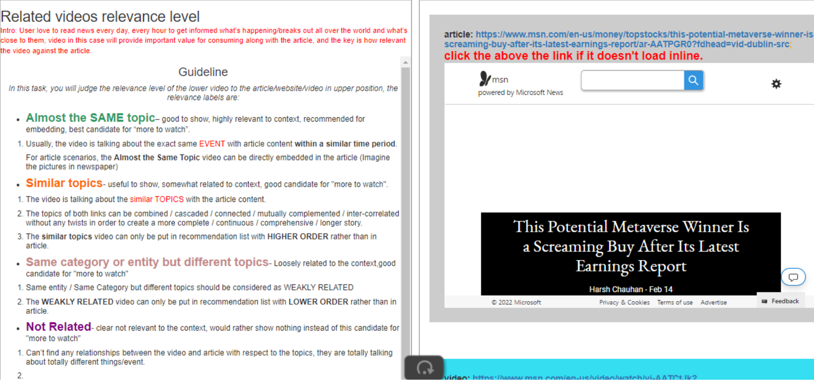
Before: The original interface with detailed guidelines permanently occupying the left half of the screen
Key Problems Identified
👁️ Cognitive Load Violation
The Problem: Guidelines occupied half the screen permanently, forcing judges to process all information simultaneously. Even when judges weren’t actively reading the guidelines, their brains were still processing the visual information, burning cognitive energy needed for the actual evaluation task.
Impact: Judges reported feeling exhausted after sessions and struggled to maintain accuracy over time.
🎯 Fitts’ Law Violation
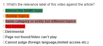
The Problem: Seven action buttons (Same story, Similar topic, Weakly related, Not related, Can’t judge, Didn’t load, Detrimental) all had identical visual treatment and small click targets. Judges had to carefully aim their cursor to select the correct option.
Impact: Increased time per task and accidental mis-clicks, especially on smaller laptop screens that many judges used.
🧠 Miller’s Law Violation
The Law: The average person can hold about 7 (±2) objects in working memory—ideally closer to 5.
The Problem: Seven options with equal visual weight overwhelmed working memory, forcing judges to re-scan all options for each evaluation instead of quickly locating the needed choice.
❌ No Visual Feedback
The Problem: After selecting an option, there was no visual confirmation showing which button had been clicked. All buttons looked identical before and after selection.
Impact: Judges couldn’t quickly verify their selection before submitting, leading to uncertainty and accidental wrong submissions.
Additional Usability Issues
- Poor space utilization: With guidelines taking half the screen, the actual work area for comparing article and video was cramped, making side-by-side comparison difficult
- Instructions buried in text: Critical instructions like “Click the link if the video didn’t load” were hidden in paragraphs that judges stopped reading after initial training
- No clear visual hierarchy: Seven relevance categories ranging from “Almost the SAME” to “Detrimental” weren’t visually organized by frequency or importance
The Design Solution
Based on user research findings and established UX principles, I redesigned the interface to reduce cognitive load, improve button usability, and provide clear visual feedback.
Core Design Improvements
1. Collapsible Guidelines
Moved comprehensive guidelines from permanent display to a collapsible panel accessible via button. This freed up 50% of the screen space for the actual evaluation task while keeping reference information readily available when needed.
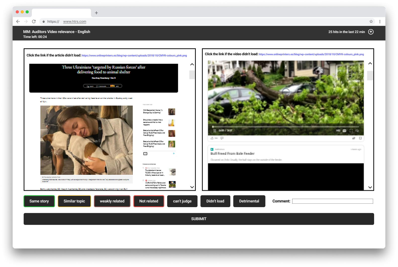
2. Side-by-Side Content Layout
Repositioned article and video content to display side-by-side, making comparison significantly easier. Judges could now see both pieces of content simultaneously without scrolling or context-switching.
3. Visual Feedback System
Implemented color-coded button states and visual borders to provide immediate confirmation of selections. When judges clicked an option, the button changed color and provided clear visual feedback.
4. Improved Button Design
Increased button size for easier clicking (applying Fitts’ Law) and added keyboard shortcuts for faster interaction by experienced judges.
5. Visual Hierarchy for Options
Used color coding to distinguish between different types of relevance categories, helping judges quickly locate the option they needed.
Before & After Comparison
❌ Before: No Visual Feedback
Buttons remained visually identical after selection. Judges couldn’t quickly verify their choice, leading to uncertainty and errors.
✓ After: Clear Visual Confirmation
Selected button highlights with color (green for positive, red for negative), providing instant visual confirmation of the action taken.
Relevance Category Design
Color-coded relevance categories making it easier to distinguish between different levels of article-video relevance
Design Philosophy
This redesign wasn’t about creating a beautiful interface—it was about applying evidence-based design principles to solve real cognitive friction. The solution prioritized clarity, efficiency, and accuracy over aesthetic appeal. By removing unnecessary information from the screen and providing clear visual feedback, the interface allowed judges to focus their cognitive energy on the actual evaluation task rather than fighting the tool.
Design Process
1. Research Phase
- Conducted research sessions with HITapp judges to understand workflow pain points
- Analyzed 500+ completed tasks to identify error patterns and completion time bottlenecks
- Reviewed support tickets and judge feedback about interface frustrations
- Mapped the existing user journey, identifying where cognitive friction occurred
- Measured baseline metrics: accuracy rate (68%), average time (~4 minutes), abandonment rate
2. Design Phase
- Created wireframes testing different information architecture approaches
- Designed high-fidelity mockups showing the new layout with collapsible guidelines and visual feedback
- Documented design rationale grounded in UX principles (Miller’s Law, Fitts’ Law, cognitive load theory)
- Developed specifications for the visual feedback system and button states
3. Testing & Iteration
- Conducted usability testing sessions with judges using prototype designs
- Gathered feedback on guideline accessibility and button usability
- Refined the visual feedback system based on judge preferences
- Validated that the side-by-side layout improved comparison efficiency
- Tested across different screen sizes to ensure accessibility for judges with smaller laptops
4. Implementation & Validation
- Worked closely with Microsoft’s engineering team to implement the redesign
- Conducted design QA to ensure implementation matched specifications
- Monitored post-launch metrics to track performance improvements
- Gathered post-implementation feedback from judges to identify any remaining issues
Results
Business Impact
The 30% time reduction meant that judges could complete 40% more evaluations per hour. Across hundreds of judges working thousands of hours, this translated to massive cost savings and faster data collection for Microsoft’s AI training needs.
The 25% accuracy improvement (from 68% to 85%) was critical for data quality. The improved accuracy meant the labeled data could actually be used for training AI models, whereas the previous 68% accuracy rate had blocked model training progress.
User Impact
Post-implementation research sessions with judges confirmed:
- Reduced cognitive fatigue: Judges reported feeling less exhausted during sessions
- Increased confidence: Visual feedback eliminated uncertainty about selections
- Faster learning curve: New judges could become proficient more quickly without guidelines constantly visible
- Better work quality: Judges felt more confident in their evaluations and made fewer accidental errors
Key Learnings
User research reveals invisible problems
The combination of observing judges work and analyzing task completion data revealed that the problem wasn’t lack of training—it was an interface that created cognitive friction during execution. Workers understood the task conceptually but needed an interface that supported efficient, accurate execution at scale.
Cognitive load is the hidden enemy in data work
Even when judges weren’t actively reading the guidelines, their brains were processing that visual information. By removing the guidelines from permanent display, we freed up cognitive resources for the actual evaluation task. This seemingly simple change had the most dramatic impact on performance.
Visual feedback prevents errors at scale
When a single task takes 3-4 minutes and judges complete hundreds per day, even small uncertainty about selections adds up. The visual feedback system didn’t just make judges more confident—it measurably reduced errors by providing immediate confirmation.
Small principled changes compound dramatically
None of these changes required a complete platform overhaul. Collapsible guidelines, larger buttons, visual feedback, and better layout—these were targeted applications of established UX principles. But applied to high-frequency tasks performed by hundreds of workers, the impact multiplied dramatically.
Enterprise design serves efficiency, not aesthetics
The redesigned interface wasn’t visually stunning. It was functional, clear, and efficient. For enterprise tools where users perform the same task hundreds of times, reducing cognitive load and task time by even small percentages creates massive value.
Relevance to B2B Enterprise Software
This project demonstrates core principles crucial to designing effective enterprise software:
- Internal tools deserve serious UX investment: These weren’t customer-facing products, but improving them had massive business impact on both cost and data quality
- Cognitive load is real and measurable: In knowledge work, reducing mental burden directly improves both speed and accuracy. Understanding cognitive psychology is as important as visual design skills
- High-frequency tasks multiply small improvements: A 30% time savings per task becomes thousands of hours when that task happens hundreds of thousands of times across many workers
- Visual feedback reduces errors: In tasks requiring accuracy, immediate confirmation of actions prevents costly mistakes and reduces user anxiety
- Progressive disclosure improves focus: Not all information needs to be visible all the time. Making reference materials accessible but not permanent allows users to focus on their core task
- AI depends on human interface design: Even the most sophisticated AI systems are only as good as the training data humans can accurately label through well-designed interfaces
These principles apply directly to any B2B software where users perform complex, repetitive work requiring both speed and accuracy—from RFP responses to data analysis to quality control workflows.