UX Writing -Dona Costura
This article is part of the UX Case Study – Using Technology to Support Seamstresses
We utilized our UX Writing learnings to ensure that the app’s texts engage with users and anticipate their needs.
The first step was to empathize with the user, and for that, we created the empathy map.
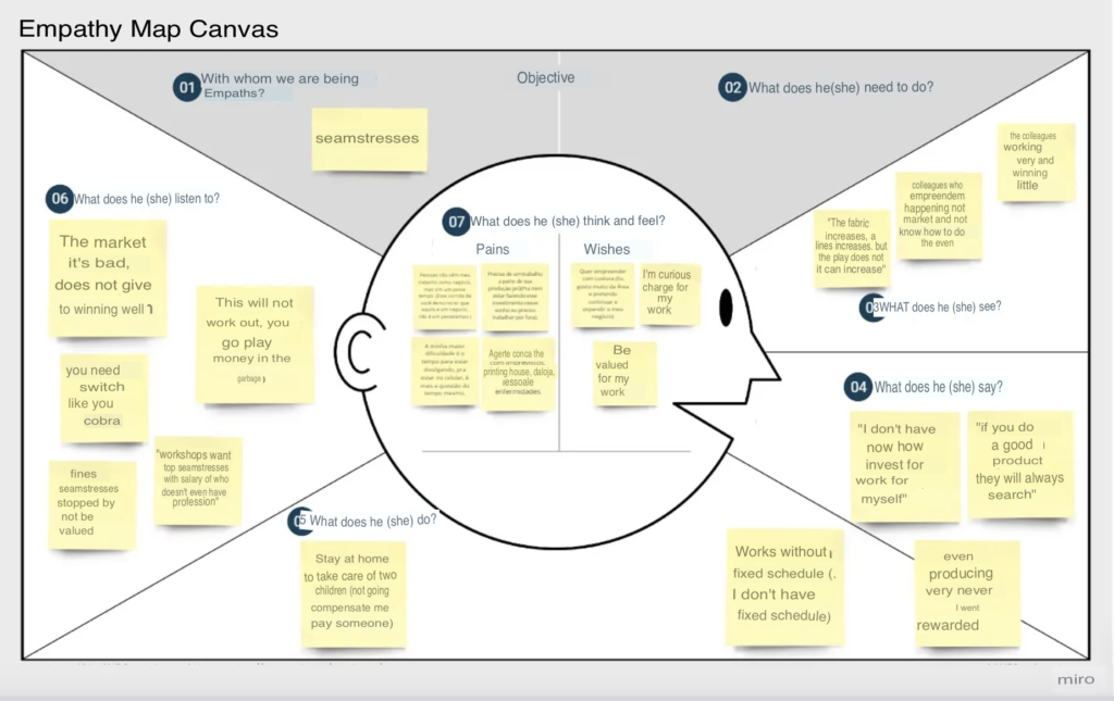
At Dona Costura, we focus on user success, starting with the consistency of the brand voice to build loyalty and distinguish ourselves from competitors.
Next, we tried to anticipate as many dialogue and interaction possibilities within the platform as possible. We edited and simplified it to ensure user satisfaction.
Finally, we ensured clarity and objectivity to guarantee ease of use, leading to user fulfillment both inside and outside the platform.
It all started with initial research and desk research, then we conducted qualitative interviews and used the material collected from the interviews, as well as from Facebook groups and app store reviews, to learn as much as possible about our audience and create the WORD CLOUD.
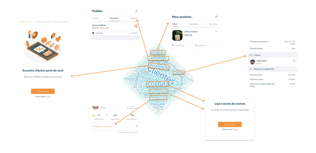
Our audience lacks familiarity with internet apps and technology, so it was necessary to pay attention to the real world of seamstresses, their work routines, and how they organize themselves. Nielsen’s 2nd Heuristic.
Additionally, during the research, we discovered that users use apps like WhatsApp and Instagram to communicate with clients or promote their work. Therefore, we also applied Jakob’s Law during the app’s construction.
Brand Voice
“They may forget what you said, but they will never forget how you made them feel” — Unknown, attributed to many.
We created the brand voice framework to guide decision-making and align UX content with the needs of the organization and users.
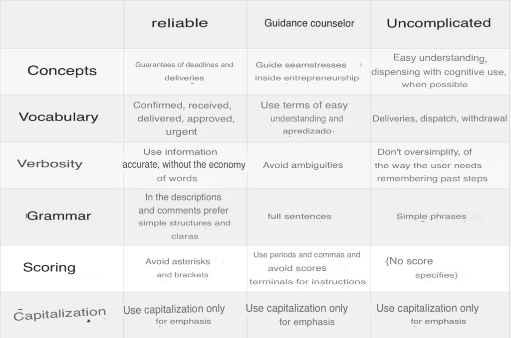
The image was translated using Yandex, see the original image here
Tone of Voice
We decided to opt for a more neutral tone. We need to be very direct to avoid confusing users, but we must always offer more clarifications in moments of confusion.
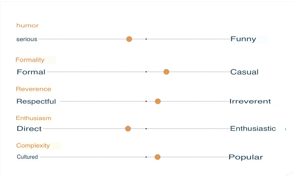
To establish the tone of voice within the dialogue, we considered the user journey, at what point they access information or receive a notification, and the physical environment they are in.
Example
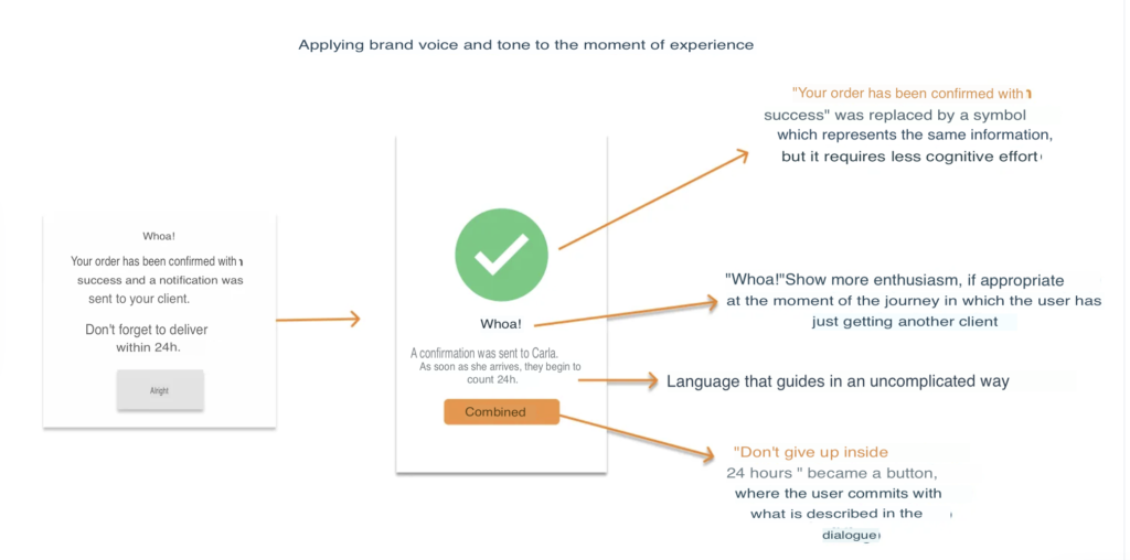
Original image here (PT)
Dialogue for content-focused design
“The role of the designer is that of a good and attentive host, anticipating the needs of their users” — Charles Eames, American Designer
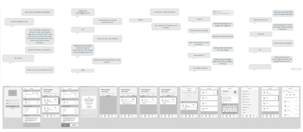
Dialogues were created to identify when specific terminology needed to be introduced and how we could anticipate user needs. After all, dialogue is how humans have interacted for millions of years. We want to bring this principle to make our digital system more familiar, easy, and intuitive.
We used the results as a starting point for creating the flow in wireframes.
UX Text Patterns
Next, we applied UX text patterns to guide users through task completion. This is a tool for the quick and scalable writing of new UX texts, based on patterns that have been tested and successful in the past.
Titles
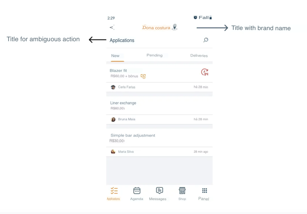
Titles clearly indicate the actions users should take, describe the page context, and are at the highest level in the information architecture.
Buttons, Links, and Other Commands
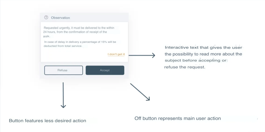
We used buttons and interactive texts to give voice to the user dialogue and goals within the app.
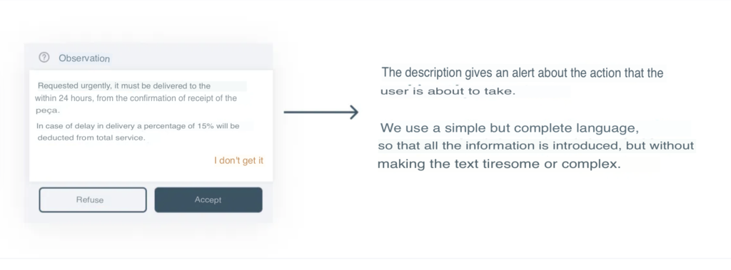
Descriptions
With descriptions, we aim to help users move forward knowing what to expect and to reduce responsibility.
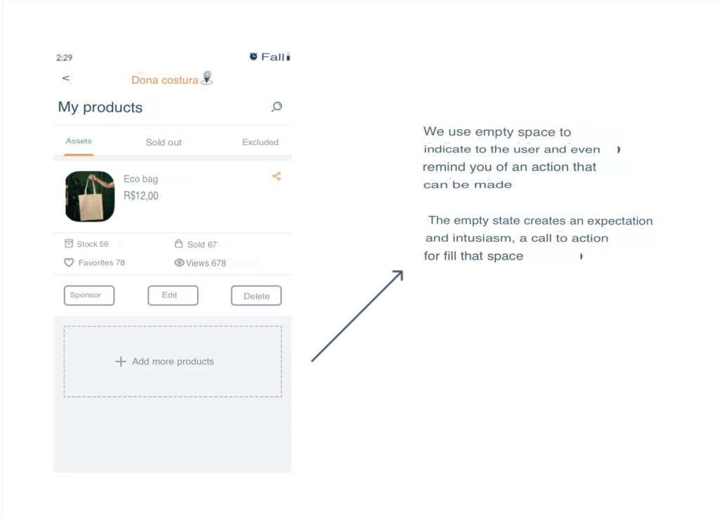
Empty States
The experience can seem quite empty when users are just starting to use the platform. Empty states can also be used to remind users to fill in something or make their interaction easier.
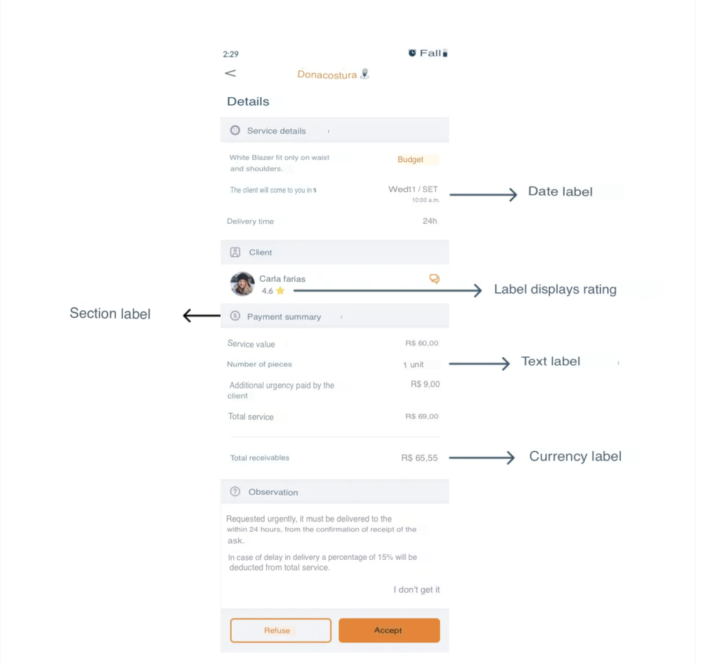
Labels
To minimize the effort needed to understand the experience, we used labels. They were also chosen and aligned with the brand voice.
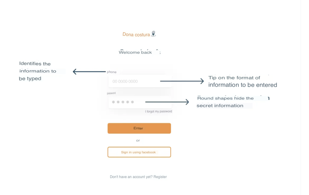
Text Input Fields
Text input fields help users provide accurate information.
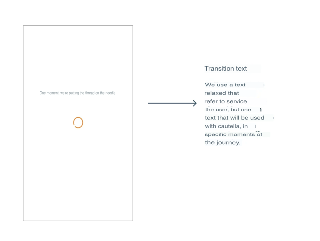
Transition Texts
We used transition texts to confirm when an action is in progress.
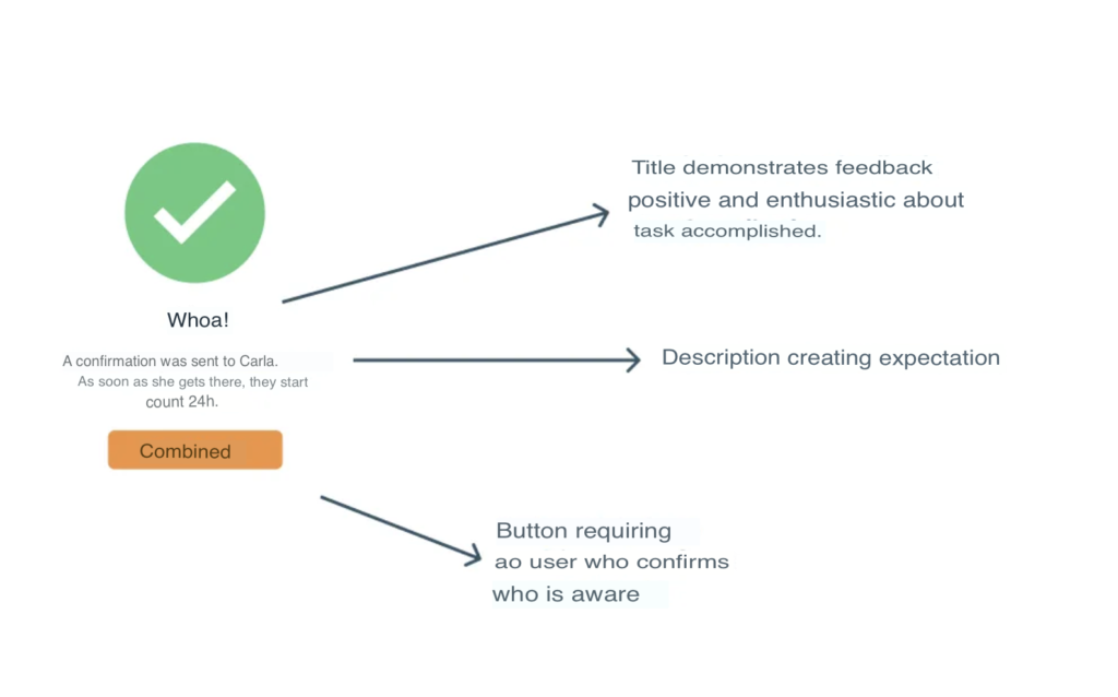
Confirmation Messages
We used confirmation messages to assure users that their progress and expected results have been achieved.
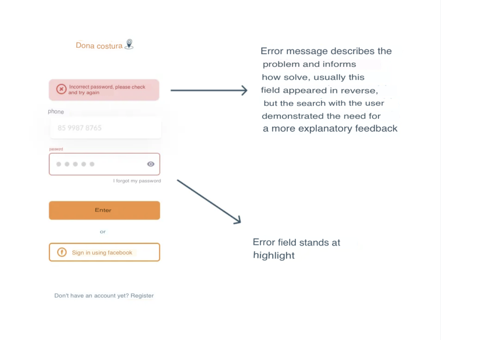
Errors
We used error messages to help users complete their tasks without wasting time or feeling confused.
From the start, our group was very concerned with each word that would be written, always thinking about how the user would interact with the information. During the first usability test, we paid attention to questioning moments of user confusion so that they could provide the expected word, allowing us to correct the interface.
The screens were corrected and submitted for a new usability test.
References
- Nielsen’s 10 Usability Heuristics — https://www.nngroup.com/articles/ten-usability-heuristics/
- 5 Heuristics for UX Writing — https://uxdesign.cc/5-heuristics-for-ux-writing-dee649dd61eb
- Book – Laws of UX: Using Psychology to Design Better Products & Services — Jon Yablonski (O’Reilly Media)
- Book – Strategic Writing for UX — Torrey Podmajersky (O’Reilly Media)